CodeSandbox
Product Design lead
2022 - 2023
A single dashboard as part of a unified CodeSandbox experience
Codesandbox is a cloud-based code editor that allows developers to create, edit and collaborate on web applications in a browser-based environment with virtually no setup/configuration time.
In early 2022, Codesandbox initiated an strategic movement to set the tone of a new CodeSandbox – bold, sharp and action-driven. By March, a new identity had been rolled out and a new product had been introduced with the goal of repositioning the company's product offering as an option for the full development cycle.
About CodeSandbox (2022)
+1mi registered users
+24mi sandboxes
Dashboard UI and Prototype by me. Editor UI by ZehFernandes.
New strategy, new product
The launch of CodeSandbox Projects redefined what working in teams meant for CodeSandbox. It reintroduced the concept of repositories and new Pro features were included.
However, after months of iterations and feedback rounds, users were not actively migrating from V1 and we were missing a massive opportunity of user acquisition.
Confusion and concerns about the integration, storage and migration of content and the disparity of features between both versions were cited as causes for hesitation.
The solution
Unifying the CodeSandbox experience
Integrating the new possibilities of CSB Projects into the original experience meant that all features and content would be located and managed in a single place. Sandboxes could quickly evolve into complex projects and the user would not have to switch environments.
To achieve this single cohesive product, it was necessary to redesign the experience of browsing, creating and organizing content.
Desigining a single dashboard
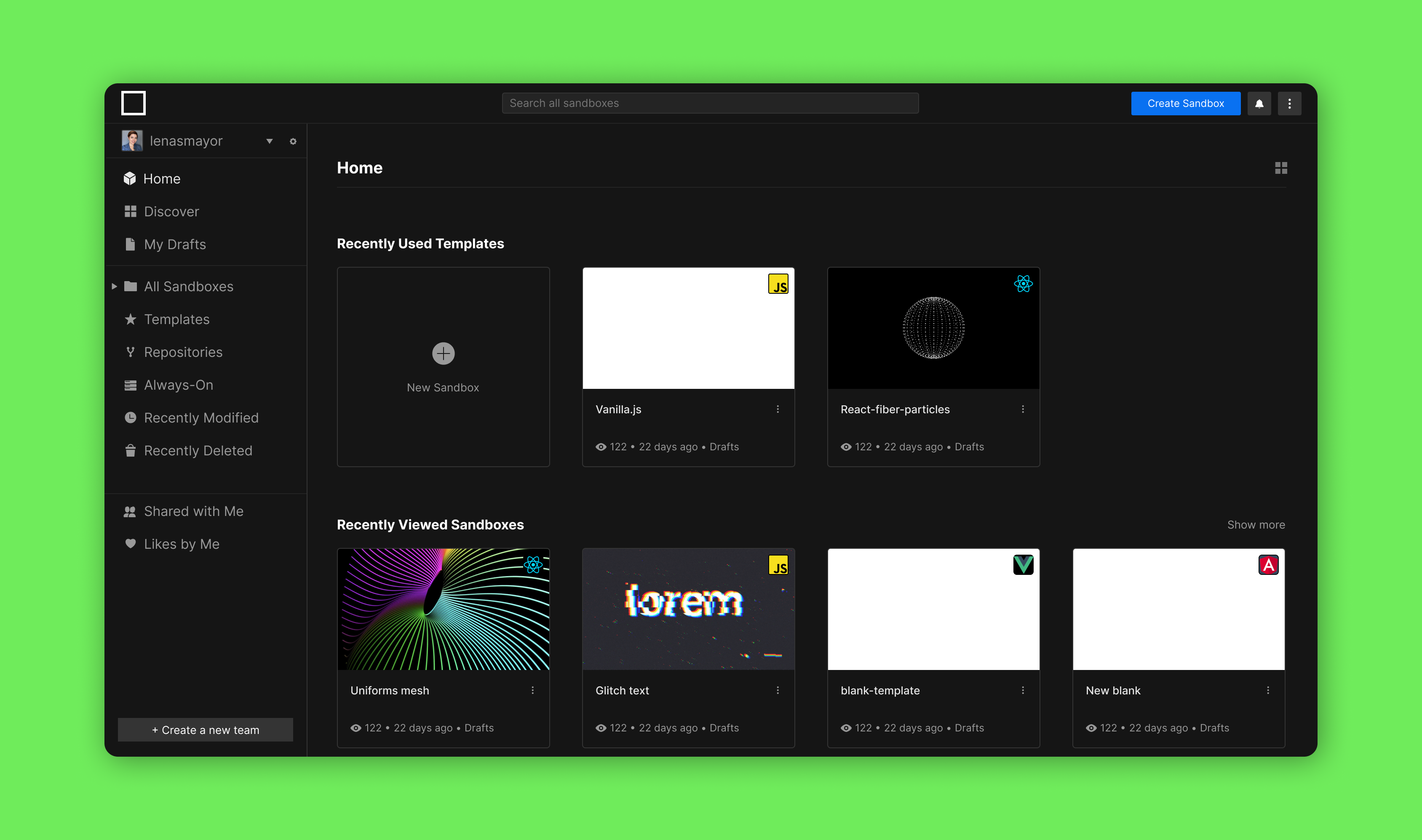
1. Updating V1
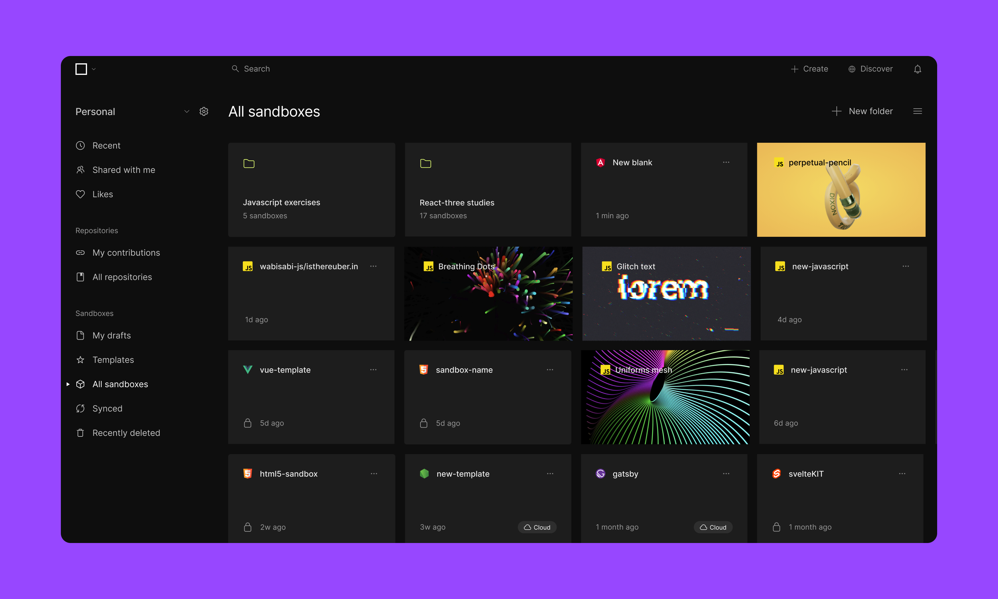
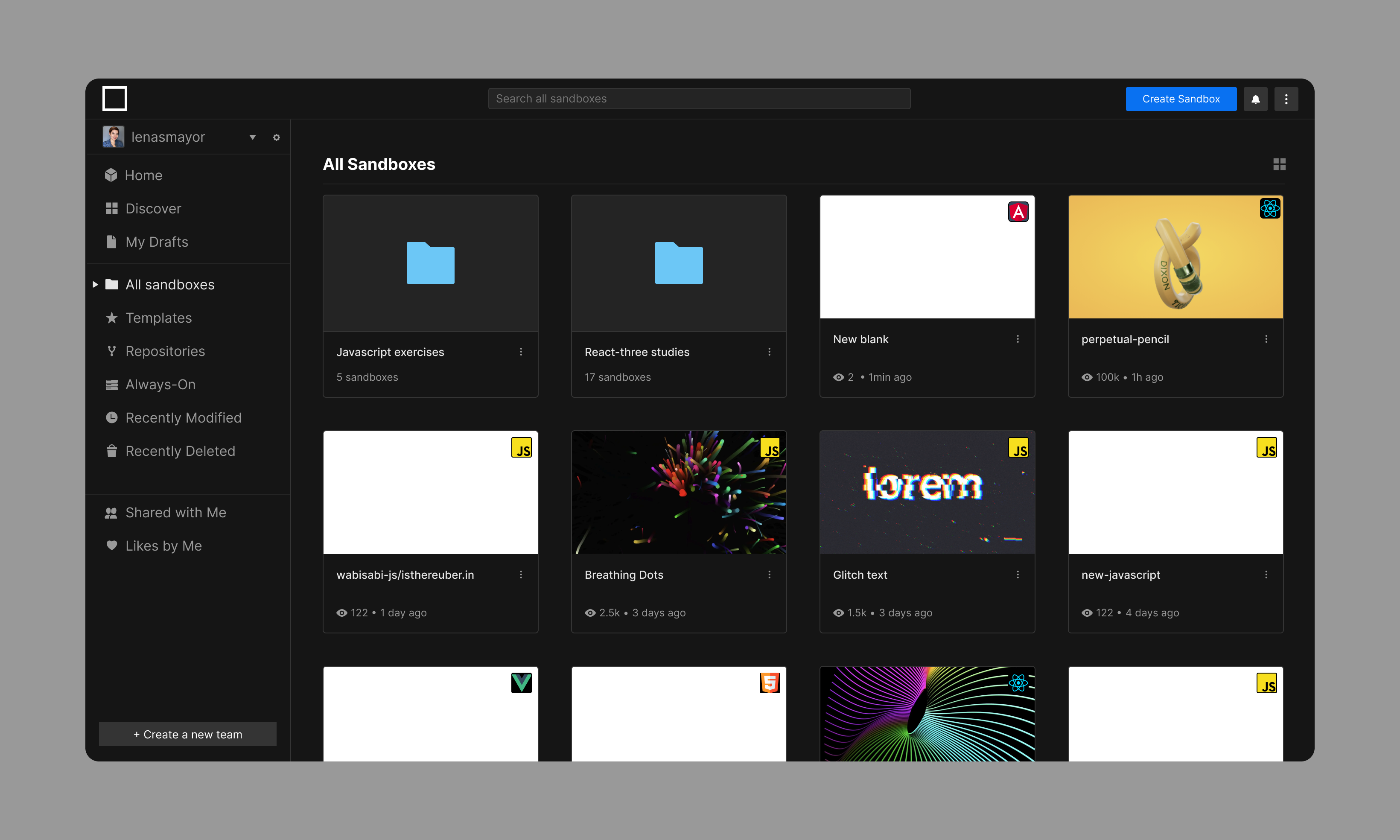
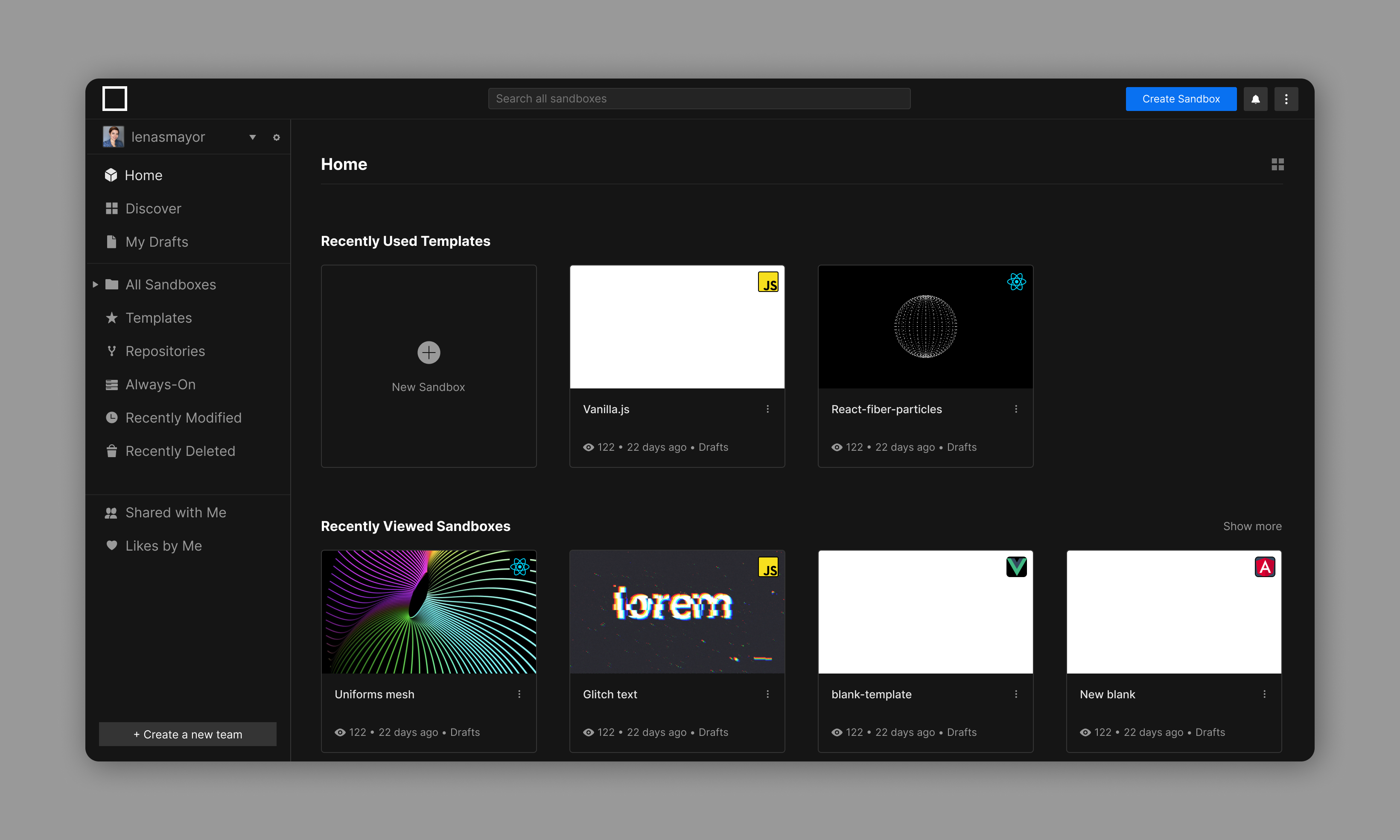
Technically it was easier to migrate the new V2 features into the original CodeSandbox dashboard. Labels, icons, colors and typography were reviewed to match the brand’s new identity and positioning.
2. A new product structure
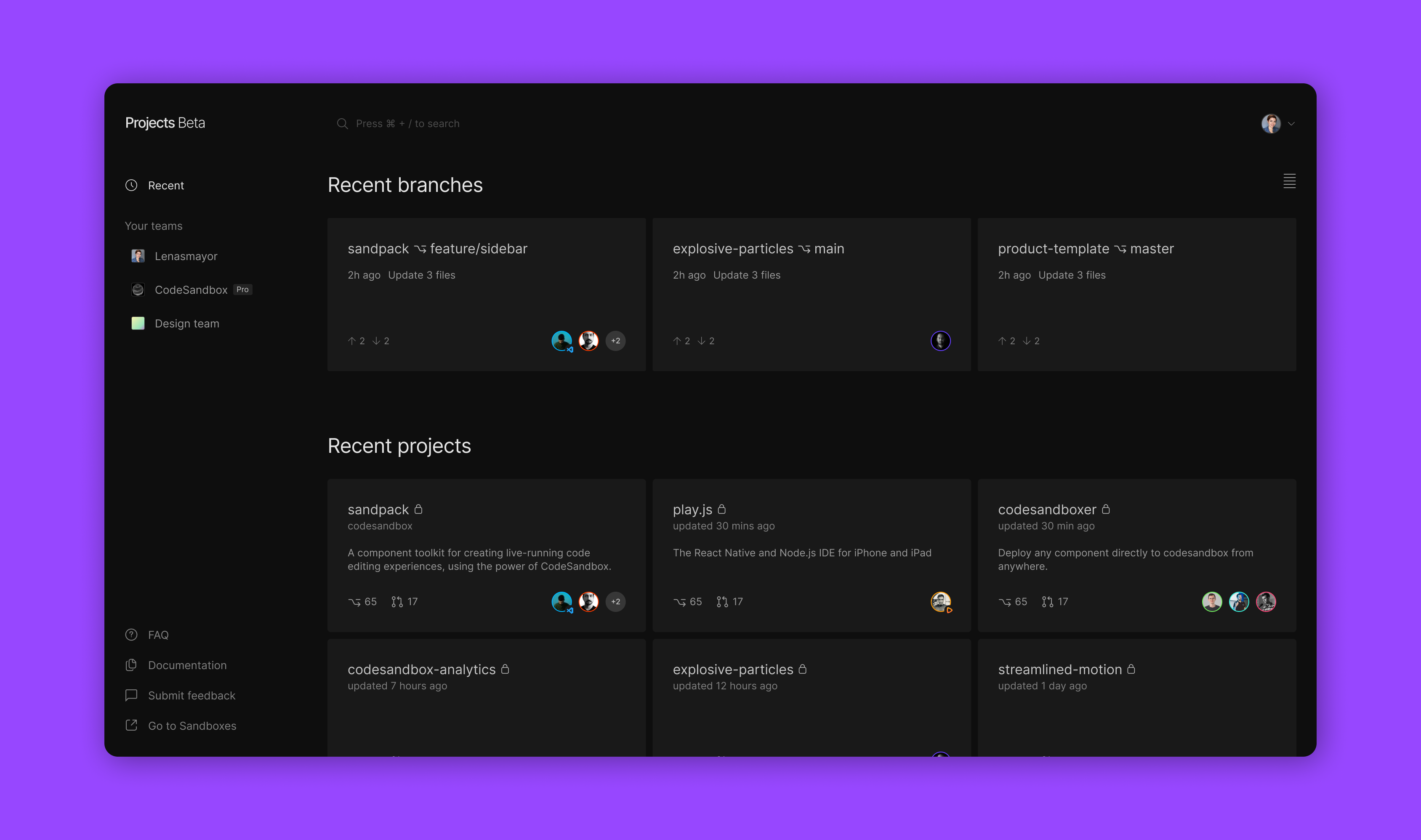
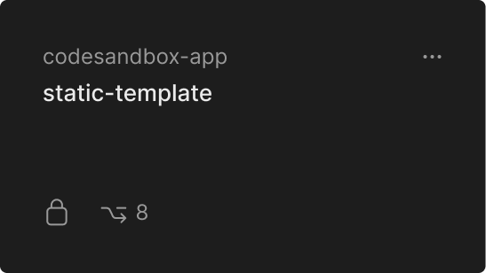
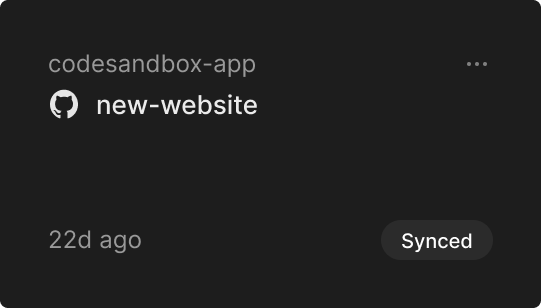
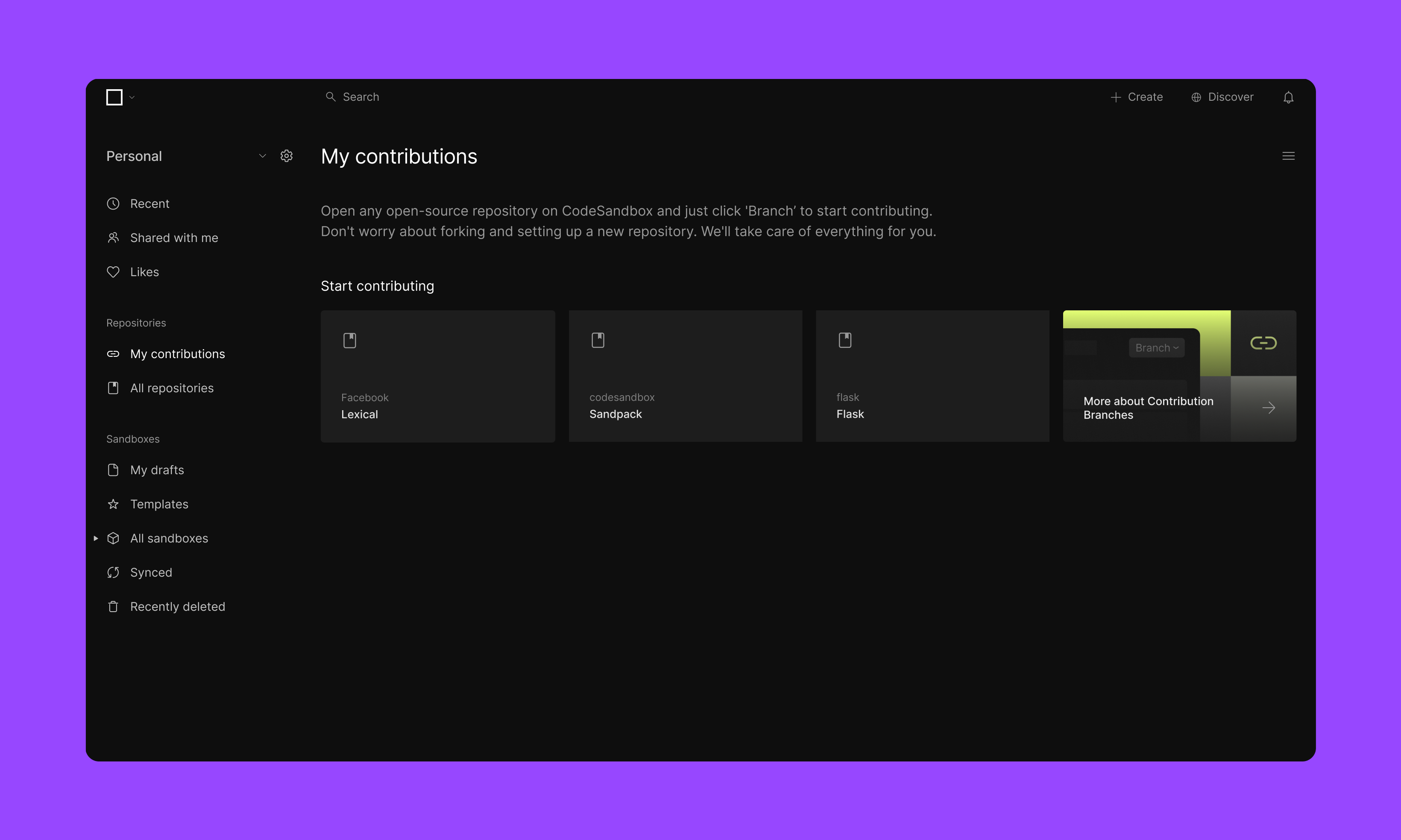
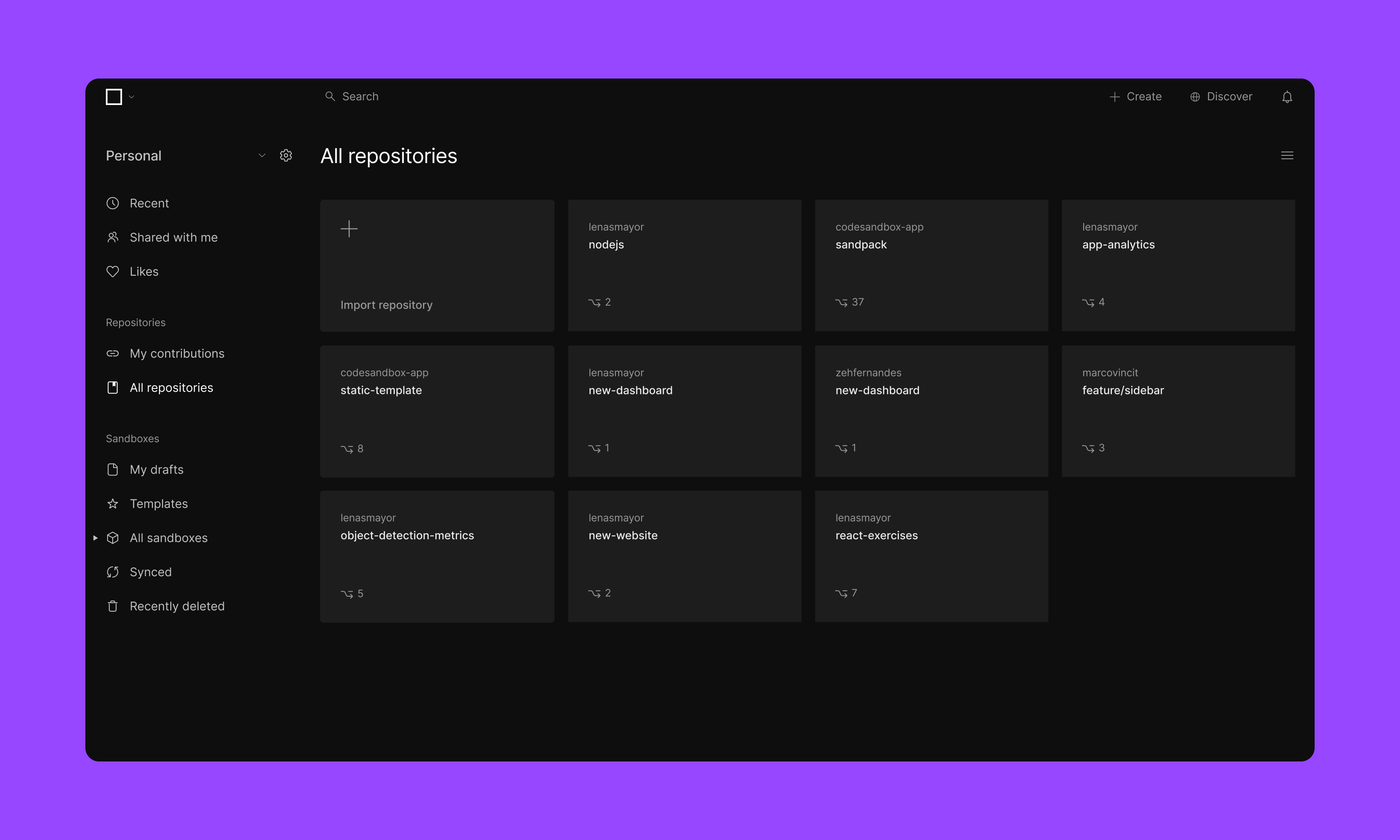
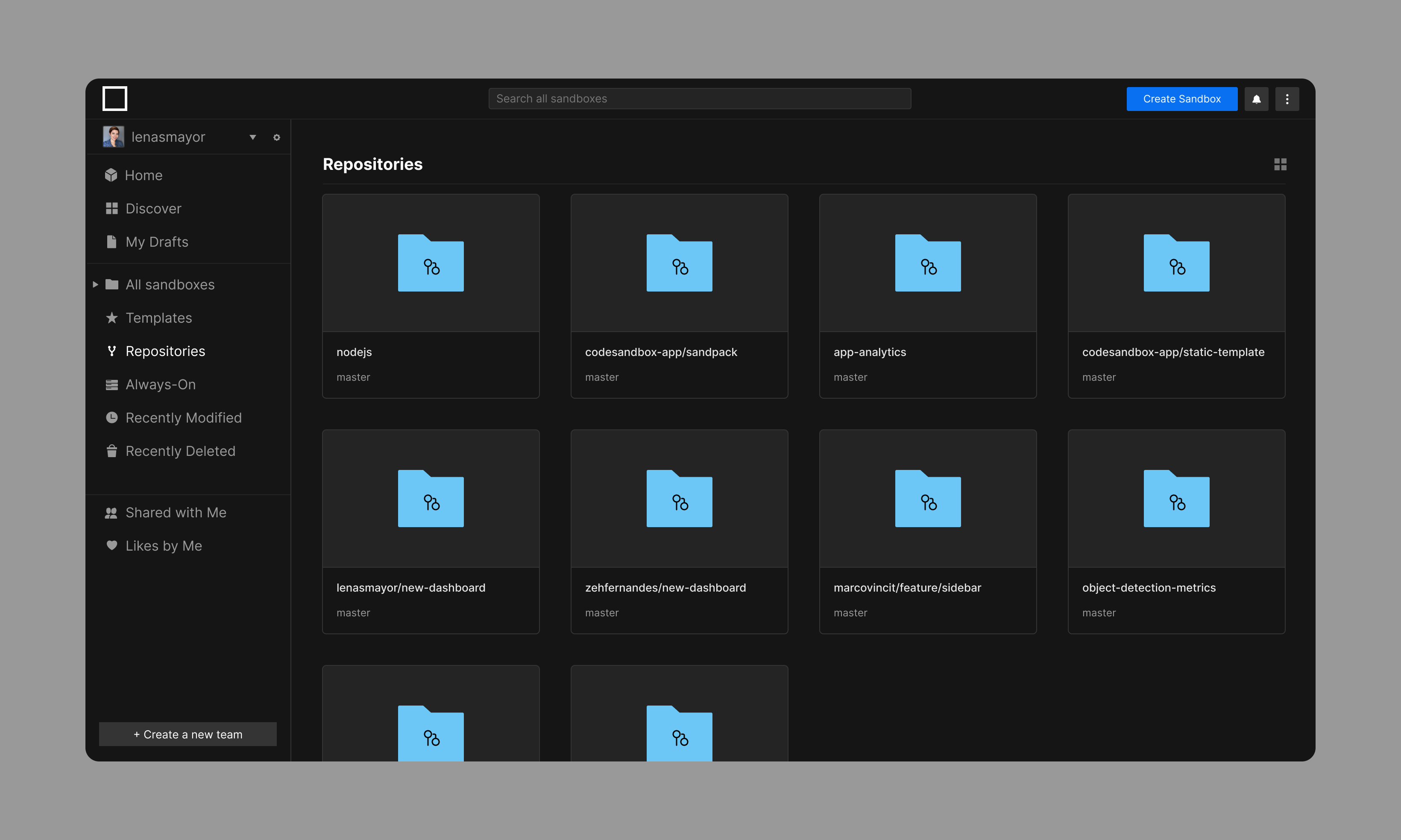
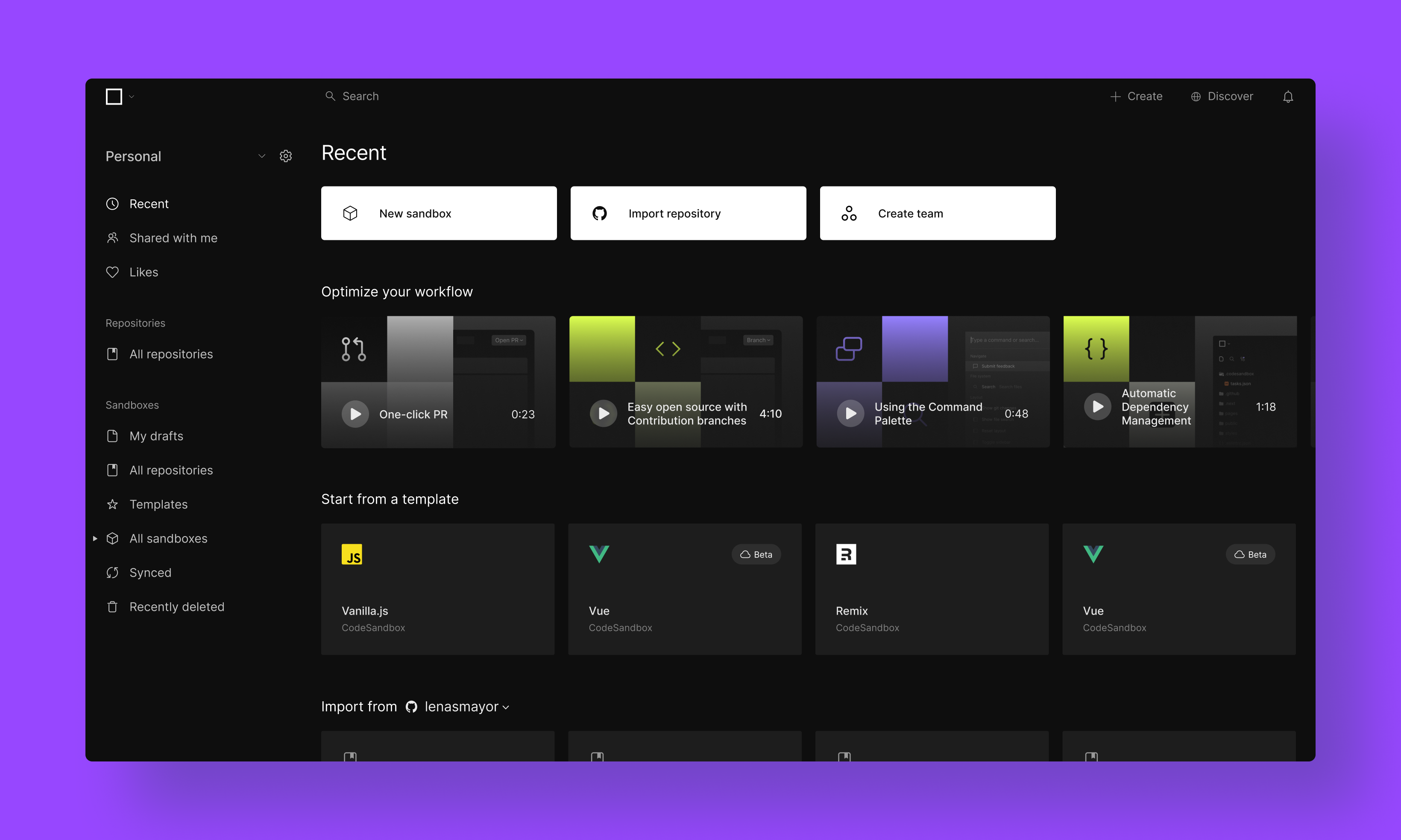
Sandboxes and repositories should live together but their organization should reflect their differences. It was important that the user was reintroduced to the concept of the Repository as a new building block of CodeSandbox.
3. The Personal team
Every new user starts with a one-person team, formerly listed as their username. This team was rebranded as Personal, as there are some unique features available to each team type.
4. Subscription touchpoints
All Free teams received a Free tag to reflect they were on a limited tier of features. More impactful touchpoints and a new page for subscription accompanied this change.
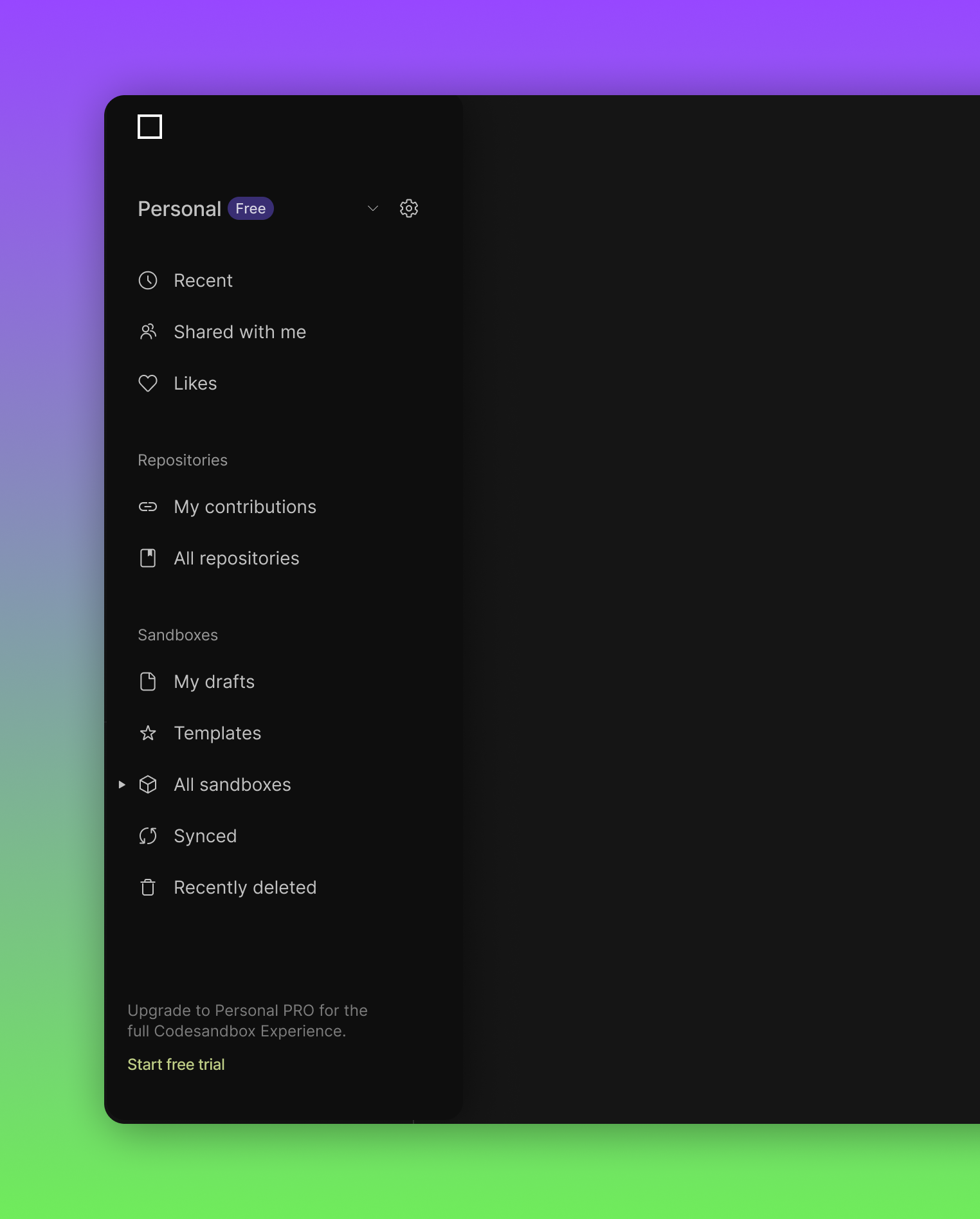
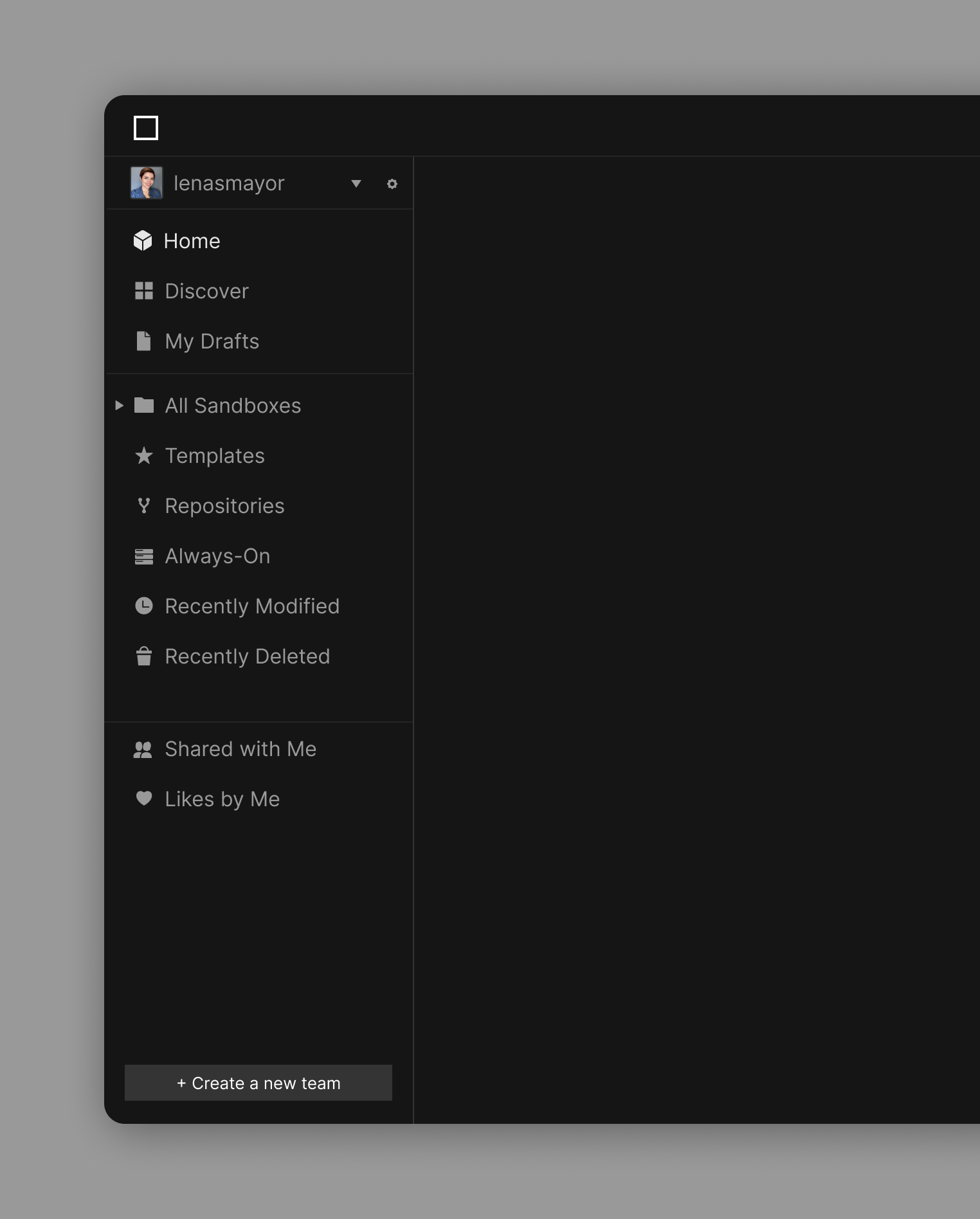
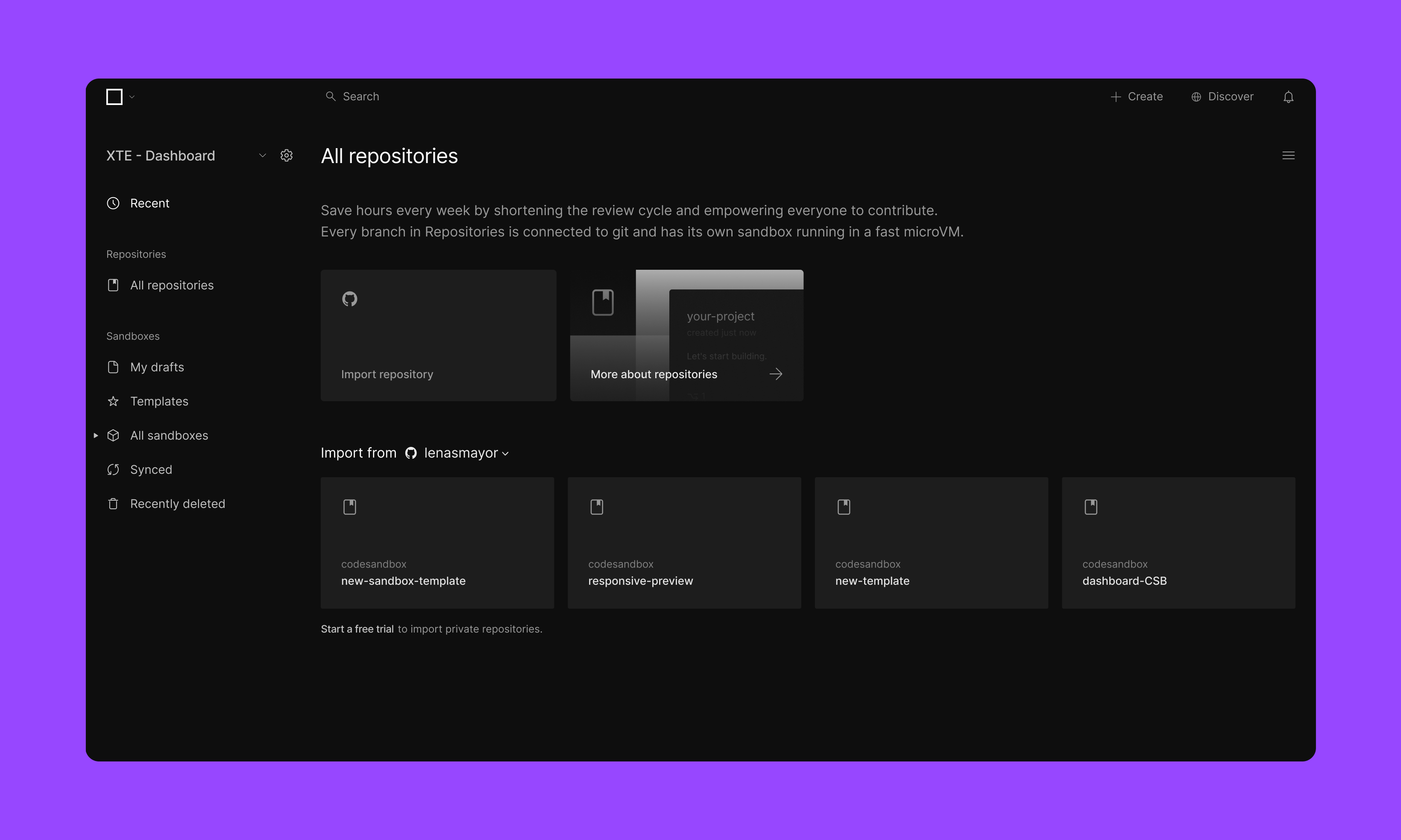
As a result, a cleaner, simpler and more functional dashboard
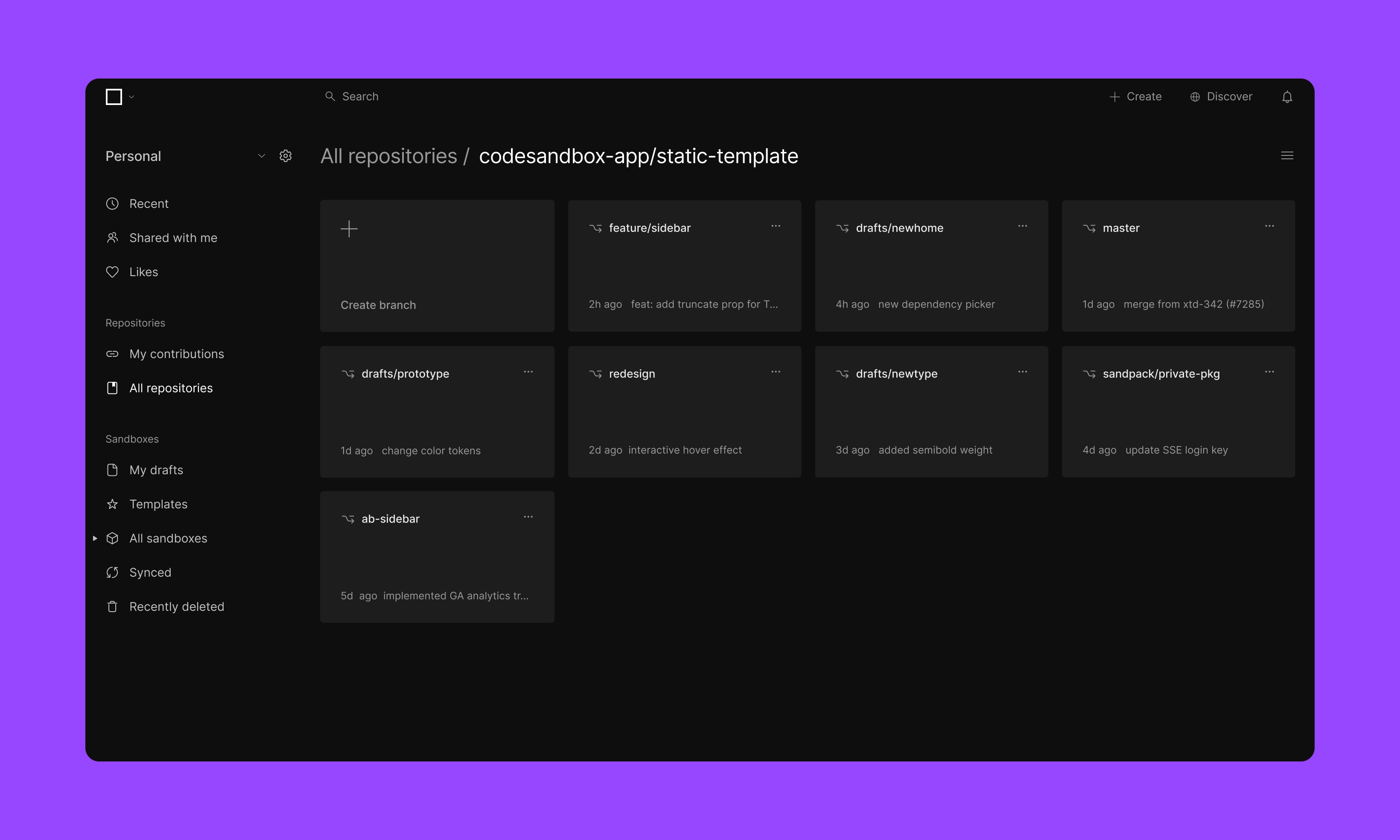
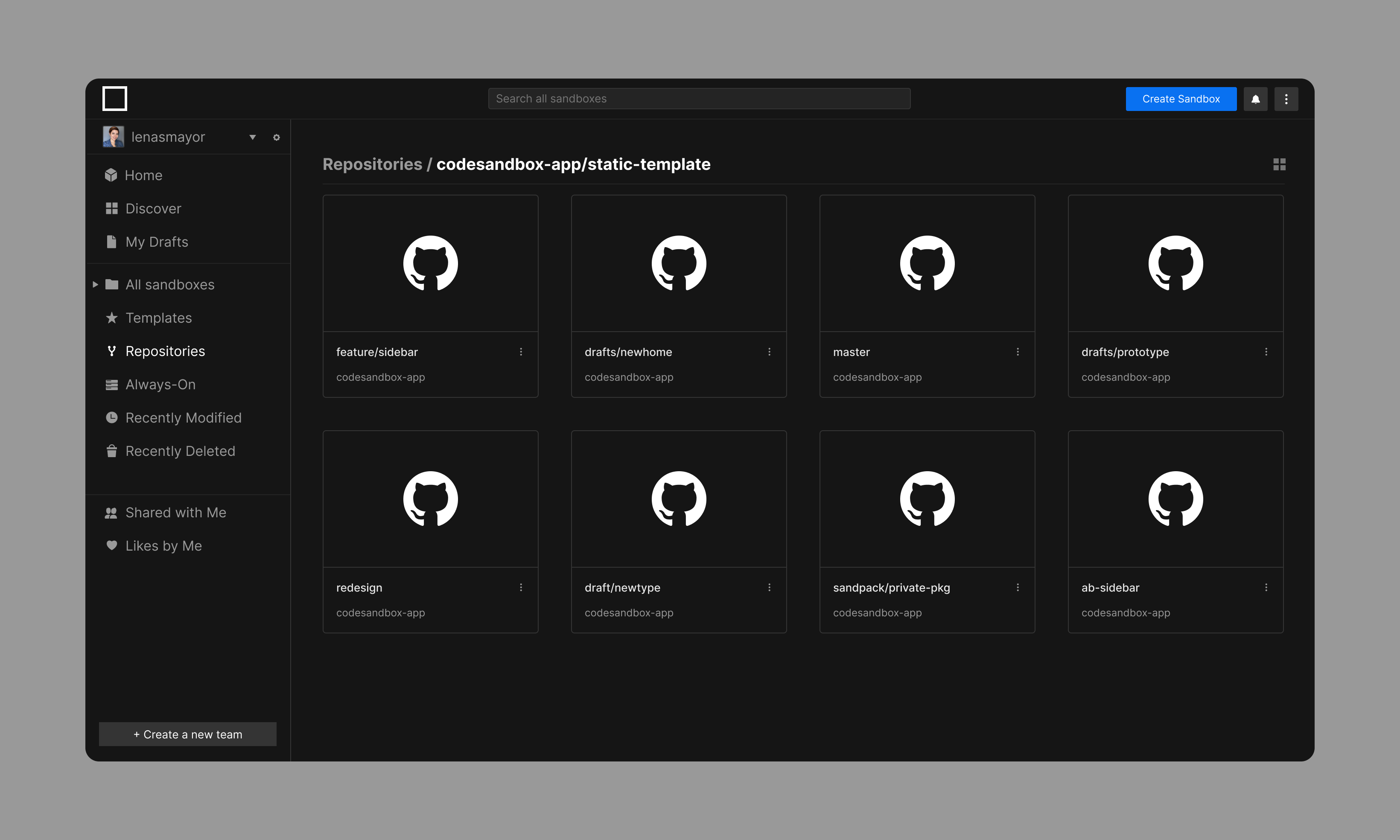
Listing all branches
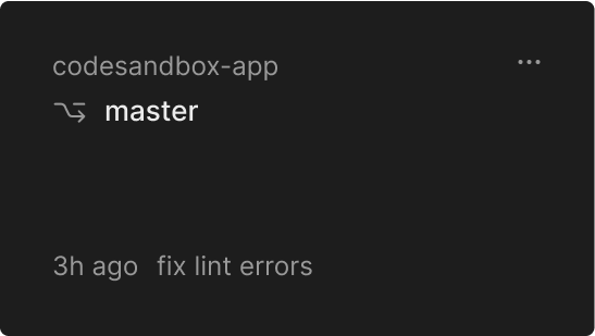
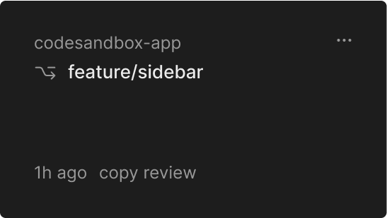
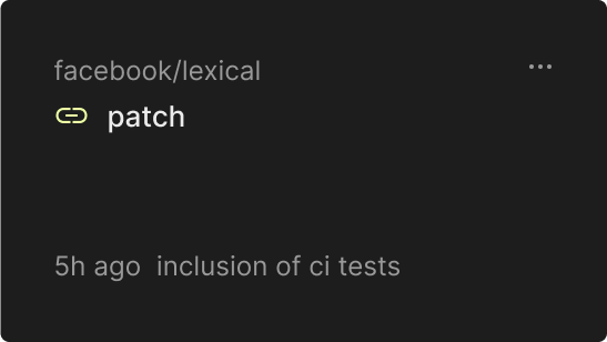
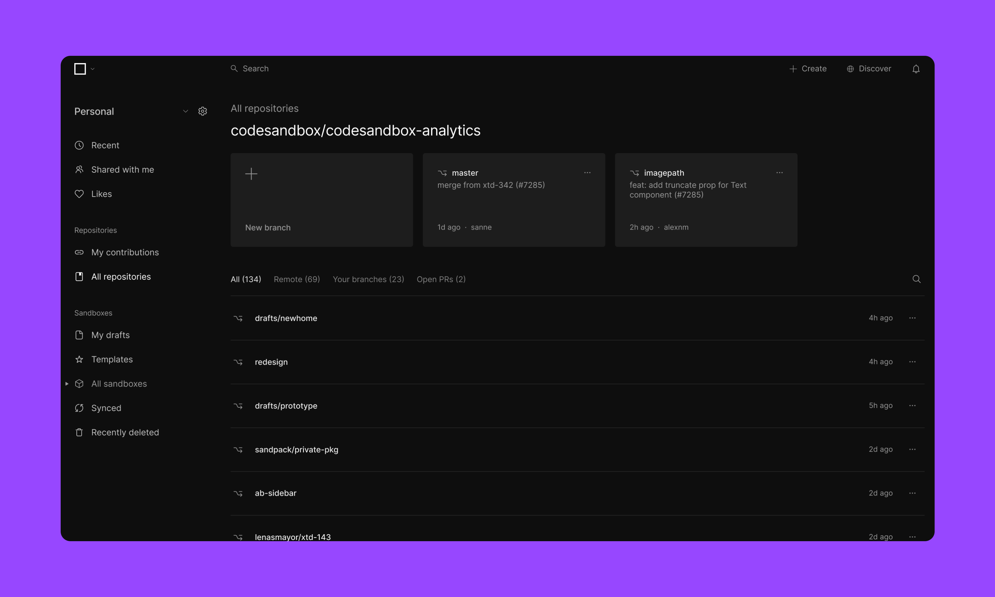
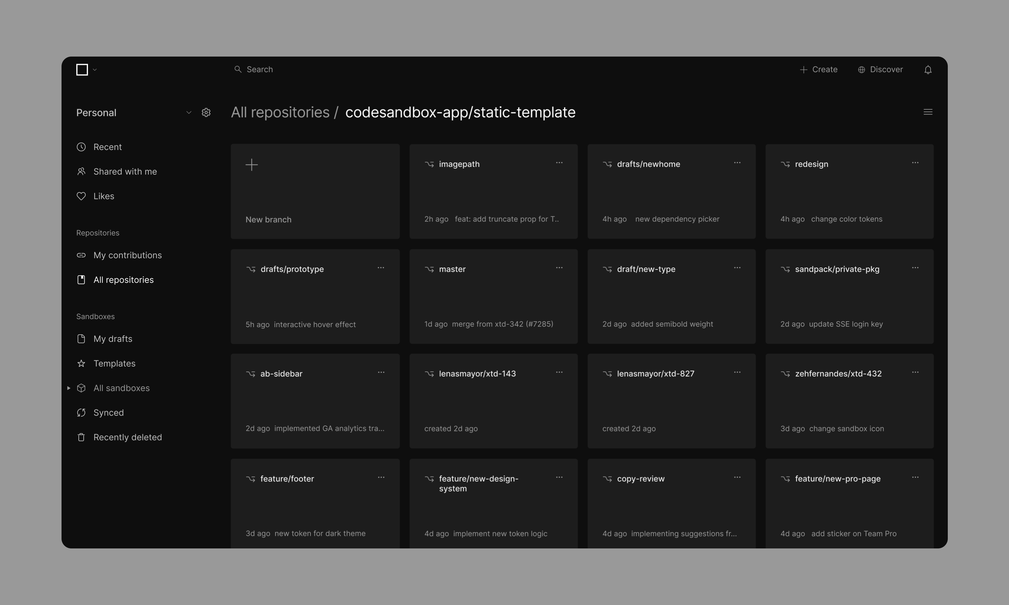
To facilitate navigating through many branches, a new and improved layout was designed. Shortcuts to create new branches and quick access were pinned at the top. All branches were displayed in a list format to facilitate browsing and new search and filtering options were added.
The Recent page
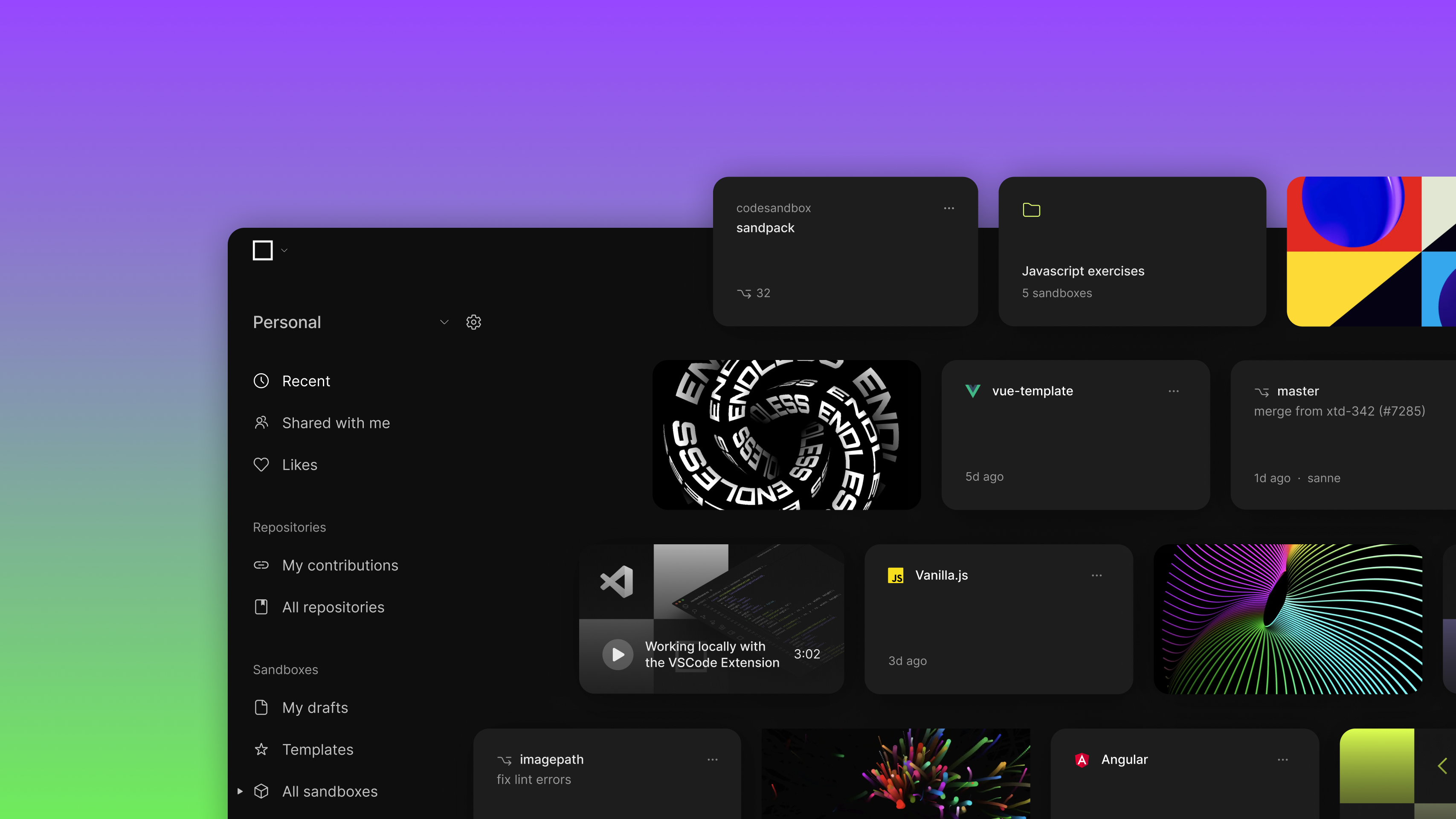
To increase user engagement, the 'Home' page was rebranded as 'Recent', where the latest sandboxes and repositories where shown together, action buttons were highlighted and new offers were introduced to facilitate action.
selected case studies
